


Wedding Color Palettes We're Seeing With Our 2026 Couples
- Allyson Brooks

- Jan 23
- 3 min read
Choosing your wedding color palette is one of those decisions that feels fun… until it suddenly feels overwhelming. Colors do so much more than decorate a space. They set the tone before guests ever arrive, shape how the day feels, and quietly tie every detail together from start to finish.
As we look ahead to 2026, wedding color palettes are becoming more thoughtful and intentional. Couples are moving away from loud trends and leaning into combinations that feel grounded, refined, and timeless. Less “statement for the sake of it,” more cohesion, emotion, and longevity.
At The Social Edit, we believe the most beautiful weddings start with a plan. This guide walks through 2026 wedding color palette ideas that feel elevated without being trendy, plus how to choose a palette that truly fits your vision.
What Is Defining Wedding Color Trends for 2026?
The biggest shift we’re seeing is intention. Couples want palettes that photograph beautifully, feel natural in their venue, and still feel “them” years from now.
Some key themes shaping 2026 color palettes:
Neutral foundations with depth
Soft, earth-inspired tones
Muted pastels instead of bright hues
Contrast through texture, not saturation
Warm undertones replacing cool grays
These palettes feel layered and elevated without overwhelming the space.
Soft Neutrals with Warm Depth


photos sourced from Pinterest
Neutral weddings aren’t going anywhere, but they are evolving. In 2026, neutrals feel warm, rich, and intentionally layered rather than flat or minimal.
Popular neutral tones include:
Ivory
Warm beige
Soft taupe
Champagne
Cream
How to use this palette: Layer similar tones together and bring in texture through linens, florals, candlelight, and subtle metallics.
Why it works: This palette is timeless, elevated, and lets your florals, fashion, and venue architecture shine.
Earth Tones, Refined


photos sourced from Pinterest
Earth tones remain a favorite, but they’re being styled with more restraint and polish.
Trending shades include:
Clay
Terracotta
Olive
Sand
Warm brown
How to use this palette: Pair deeper tones with lighter neutrals and natural textures. Avoid using every dark shade at once.
Why it works: Earth tones create warmth and depth while still feeling calm and welcoming, especially beautiful for outdoor or nature-forward venues.
Muted Pastels Done Right


photos sourced from Pinterest
Pastels are making a comeback, but in a more grown-up way. Think soft, dusty, and balanced.
Popular muted pastels:
Dusty blue
Soft sage
Pale lavender
Blush with beige undertones
How to use this palette: Keep pastels subtle and let them live in florals, stationery, or attire rather than everywhere at once.
Why it works: These tones bring romance without feeling overly sweet or youthful.
Modern Monochrome


photos sourced from Pinterest
Monochrome palettes are perfect for couples who love clean lines and editorial design.
Common approaches:
All white with layered texture
Shades of beige and taupe
Black and white warmed up with neutrals
How to use this palette: Focus on texture, shape, and lighting — sculptural florals, layered linens, thoughtful candle placement.
Why it works: Monochrome designs feel intentional, modern, and photograph beautifully.
Deep Neutrals with Soft Contrast


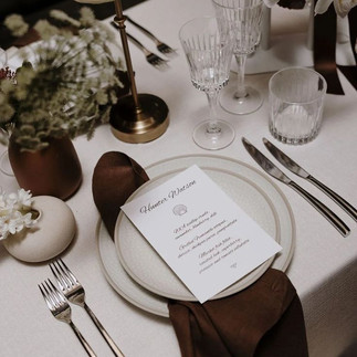
photos sourced from Pinterest
For couples who love a little drama without going full moody, deep neutrals are a standout for 2026.
Trending tones include:
Espresso
Charcoal with warmth
Deep olive
Smoky taupe
How to use this palette: Use darker shades in smaller moments — menus, table numbers, attire — and soften them with candlelight and lighter florals.
Why it works: You get depth and sophistication without the space feeling heavy.
How to Choose the Right Palette for You
With so many beautiful options, choosing can feel overwhelming. A simple framework helps.
Consider:
Your venue and its surroundings
Season and natural light
Personal style and fashion preferences
Cultural or meaningful influences
Your photographer’s style
Your palette should work with your environment, not compete with it.
Where Couples Often Go Wrong
Even beautiful colors can feel off if they’re overdone or mismatched.
Common mistakes:
Using too many colors
Ignoring undertones
Overmatching everything
Following trends without considering the venue
Forgetting how colors photograph
A refined palette usually includes one main neutral, one supporting tone, and one accent.
How a Planner Helps Bring It All Together
At The Social Edit, color palettes don’t exist in isolation. They connect to florals, rentals, lighting, layout, and overall flow.
We help with:
Refining palette options
Ensuring consistency across vendors
Avoiding overuse of color
Balancing texture and tone
Protecting the overall aesthetic
This guidance ensures your design feels intentional, not accidental.
Ready to Design a Wedding That Feels Effortless and Elevated?
At The Social Edit, we specialize in seamless, stress-free wedding experiences. From full-service planning to day-of coordination, we help couples bring their vision to life with sophistication, creativity, and thoughtful design.
If you are ready to refine your wedding color palette and create a cohesive, beautiful celebration, we would love to connect.


Comments